4 Essential Elements Of A High Converting Landing Page

Running a business in the current digital market is all about balance. Presentation is equally important as the logistical side of the business. To ace the presentation and online presence of a business with a well-designed website, one needs to also focus on the landing page, a portal that bridges the gap between a random browser and a customer.
It is basically geared to attract potential customers to interact and possibly become a patron. To do this, a business needs to focus on conversion rate optimization, which is defined by the ratio of the number of people who became customers to the actual number of people that visited the landing page. Thus, any business owner would want a great conversion rate for their landing page.
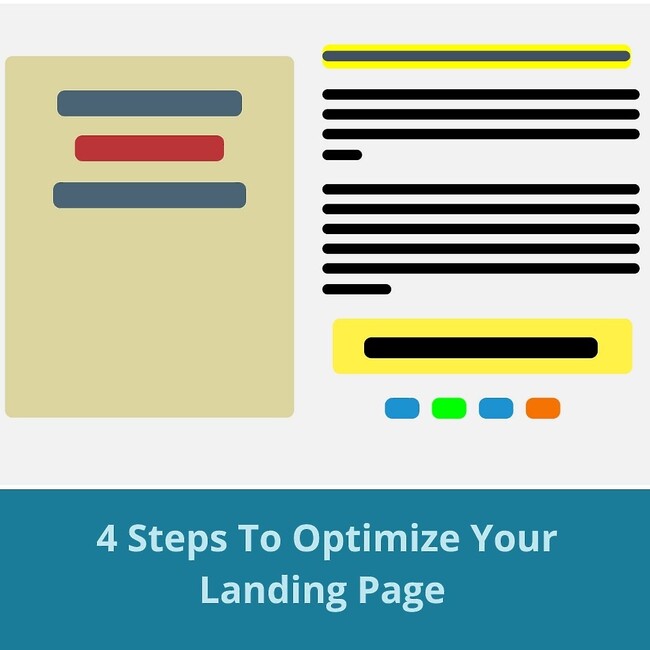
4 steps to achieve an attractive landing page.
1. Focus On Quality Content
The content on your page is one of the most important aspects of creating a successful landing page. Thus, make sure that the content is appealing, addresses the pain points of the customer, and offers a solution that is your unique selling point. Apart from this, the content also needs to be succinct as lengthy paragraphs will guarantee a higher bounce rate.
2. Prioritize Visuals
People are visual creatures, and images are far more enticing than any text. Hence, rather than addressing all your customers with content, also focus on high-quality images and videos that also address the above-mentioned points. This way, you can target the user visually as well as through text. Combine these images with eye-catching colors and a pleasing layout and you are guaranteed to win over some new patrons.
3. Emphasize CTAs
Apart from attractive visuals and texts, you also need to provide a prompt to the customer which will encourage them to purchase your product or service. This is known as a call to action or CTA and is perhaps the most important part of a landing page. Thus, to achieve such a prominent CTA, make sure that the button or prompt is visible throughout the page and must stand out to the user. However, it’s also important to not be too pushy, or customers might find it unpalatable. Hence, mastering CTAs is a balancing act that requires some trial and error.
4. Remove Distractions
Since a landing page is geared towards converting users into customers, it needs to be a lot more streamlined than a website. Make sure that there are no distractions in the form of other links that might take users to different pages and remove all elements from the page that might be a potential distraction. The major idea behind this is to redirect the customer’s thoughts toward the CTA and to boost your landing page conversion rate.
Thus, by following these 4 steps, your business will have a spectacular landing page that will bring in a lot of new clientele.
Are you looking for more help to grow your business? You can rely on us at Vestra Inet for developing a website that is suitable for your specific business. Get in touch with us today to learn about our wide range of services.
